International Colour Day: Why Tracking Colour Matters

 Emi Nojiri
 To mark International Colour Day, our Creative Director, Naomi Pollard explores why brands should focus on colour evolution, rather than one single ‘hero colour’.
Every year on International Colour Day, we celebrate the powerful role colour plays in shaping how we design, feel and experience the world around us. Yet when colour trends are discussed, the conversation often centres around a single “hero colour”, leaving one shade behind for the next new thing.
While these hues and combinations capture attention, they only tell part of the story. Colour doesn’t change suddenly or wholesale. It evolves, responding to overarching cultural shifts, emotional needs and changing design priorities.
Understanding this evolution allows brands, designers and creatives to move beyond reactive trend adoption. Meaning that they can focus on deeper, more resilient colour strategies; identifying why colours resonate, not just which colours are popular.
From Moment to Movement
A key colour provides a snapshot, but colour evolution reveals the bigger picture.
By observing how tones gradually soften, intensify or merge with new influences, designers gain insight into why colours are emerging and where they might move next. This approach supports longer-term planning, helping brands develop palettes that feel considered and adaptable rather than reactive.
Tracking colour evolution also unlocks greater creative freedom. Instead of working with one headline shade, designers can explore tonal families, layered palettes and transitional hues that create richer and more flexible colour stories.
This is why we created our Colour Evolution reports; to explore the key shifts over time. The reports are used by designers who need to ensure longevity and understand when and how to update core shades.
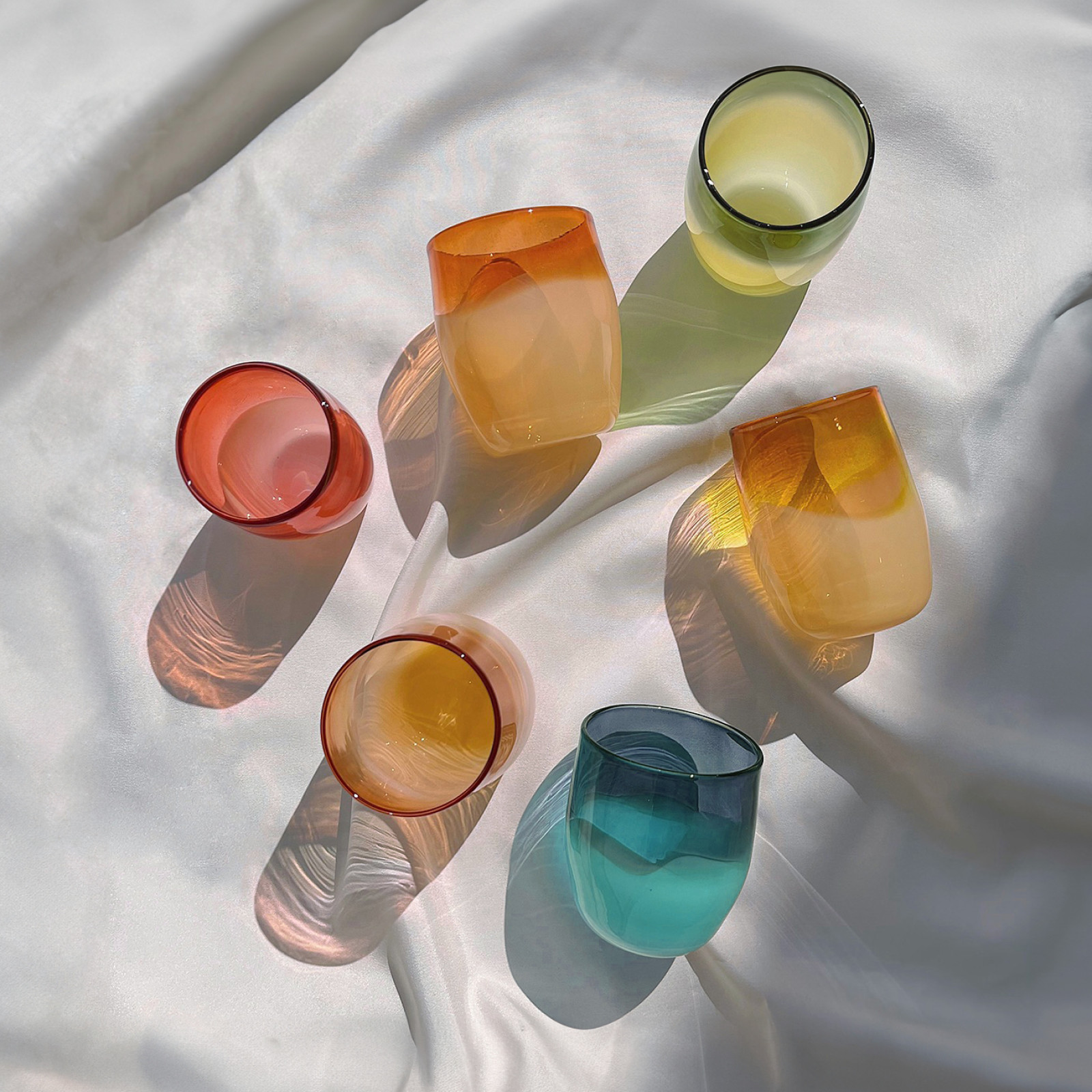
Why It Matters in the Home
Hubsch & EllisonIn the home industry, colour must work harder and last longer. Interiors are emotional, lived-in spaces, where colour shapes atmosphere and wellbeing.
Because consumers expect longevity from interior products, colour trends here tend to evolve gradually. Rather than dramatic shifts, we see subtle transformations — pastels becoming chalkier, neutrals warming into clay tones, or light and airy spaces gradually morphing into deep richly-hued sanctuaries.
Understanding these shifts helps brands design palettes that feel timeless yet progressive, supporting collections that remain relevant across multiple seasons.
For 2026, our colour evolution analysis highlights two key directions:
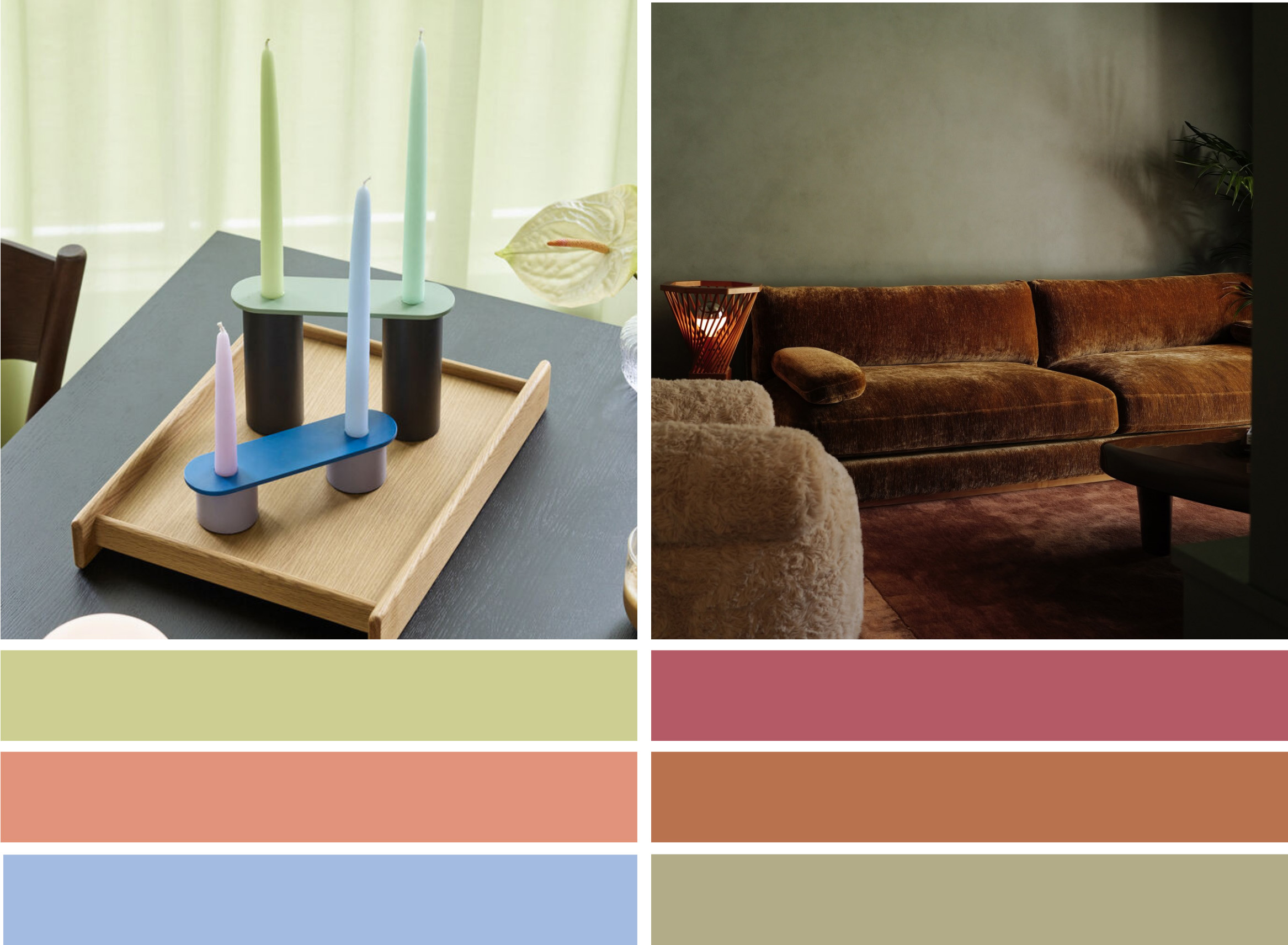
- Luminescence: Spring Summer 2026 sees a sense of lightness and breeziness across colour. There is a notable shift towards colours with an inherent luminance and glow. Calming greens and blues possess a feeling of implicit light, bringing a sensorial sensation to colour and reflecting an ethereal mood. These shades are successful on high-shine surfaces, as well as emerging as a key paint shade. Yellow-based greens continue to play an essential role, showing up in statement complimentary pairings, against rich aubergine shades or pale lilacs.
- Sophisticated Warmth: As a counterbalance, comforting warm hues continue to grow in importance. Householders will be drawn to grounding neutrals, browns and earthy or elemental influenced shades like cocoa browns, sienna clay tones or dusky rose pinks.
By combining luminous, calming tones with warm, grounding shades, these colour evolutions reflect to a wider societal focus on spaces that nurture both inspiration and security.
Emotionally Charged Kids’ Palettes
The kids’ industry operates with a different set of priorities. Colour here is closely linked to imagination, play and emotional development.
Palettes are often brighter, more expressive and more experimental. However, even in this space the focus is shifting from simple primary colours toward more nuanced, contemporary palettes that can live comfortably within the modern home and away from binary gendered colour to something more inclusive.
For 2026 two different levels of energy are guiding colour evolution:
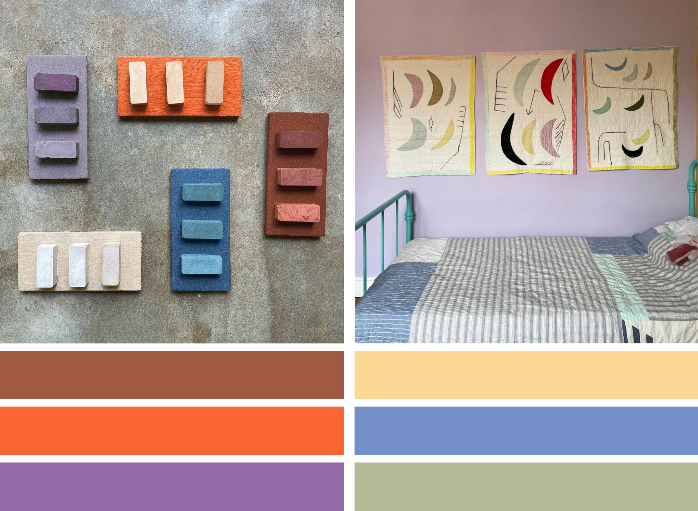
- Vibrant Optimism: Imbued with a mystical, spiritual energy, sensorially-charged hues of vivid orange and regal purple radiate pure energy. The warmth and strength of these gender-neutral shades reflects a somewhat mystical energy and adventurous spirit that works well for older kids into a tween audience
- Gentle Nostalgia: Drawing upon the childhood memories of parents and caregivers, nostalgia is another key ingredient for emotive colour selections in 2026. Softened brights create a middle ground between primary colours and pastels. Buttery yellows and sky blue shades evoke an uplifting, easy-going summer mood, evoking the nostalgia of carefree summers.
Designing with Confidence
Ultimately, exploring colour evolution moves the conversation from trend chasing to trend fluency.
It enables brands to anticipate shifts, build stronger palettes and develop colour strategies that reflect the broader cultural implications of colour selection as well as balance longevity with excitement.
On International Colour Day, it’s a reminder that colour is rarely about one defining hue. It’s about the shifts, layers and transitions that shape how we experience colour over time.