Colour Direction 2022 Home & Interiors
 Six N Five
 Trend Bible’s Colour Direction 2022 outlines six shades chosen by our colour experts, based on our seasonal trend forecasts for 2022. These directional, yet commercially viable shades represent what we believe to be central to life at home. We have split them into two groups; for Home & Interiors and Baby & Kid’s Lifestyle, with three key colours for each.
No colour works in total isolation. Our trend forecasting team have carefully selected these primary colours to work with coordinating colours. We’ve mapped our home trends in seasonal palettes for Spring Summer and Autumn Winter to show how they can be used. Whilst the Home & Interiors trend insights are primarily applicable for decor, we also develop these with broader categories in mind, including consumer products, home tech, personal care and food and beverage.
Home & Interior 2022 colour forecasting
Cayenne, PANTONE® 18-1651 TCX
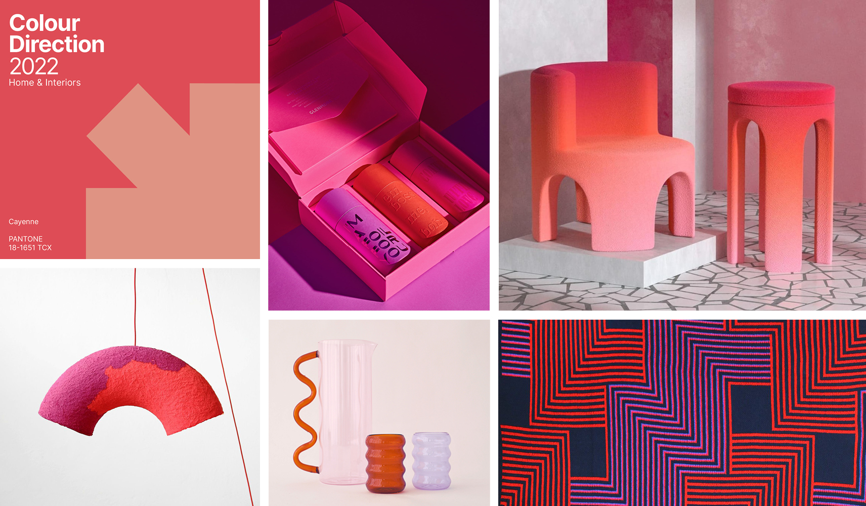 Left to right: Glenmore Print, Seba Morales, Polina Miliou, Sophie Lou Jacobsen, Ditto House.
Following a tumultuous era of hard truths and significant social shifts, customers wholeheartedly embrace the escapism offered by the strange, surreal and otherworldly. Luminous colours grant a fantastical escape from the constraints of real-life as householders explore dream-states as a channel for creativity. Cayenne encourages curiosity and fires up the imagination.
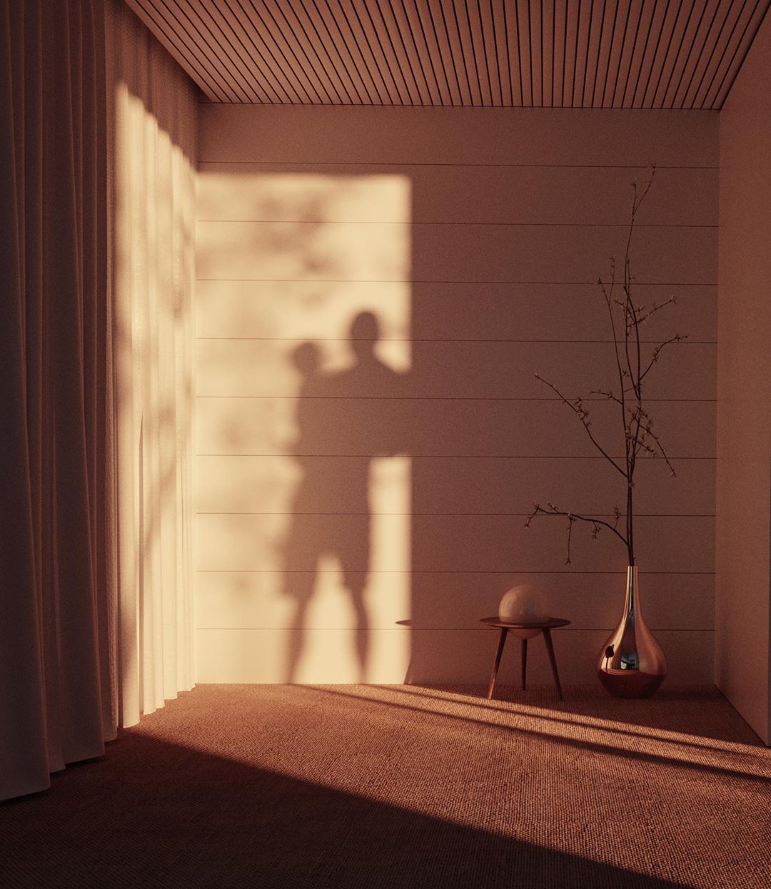
Sheepskin, PANTONE 14-1122 TCX
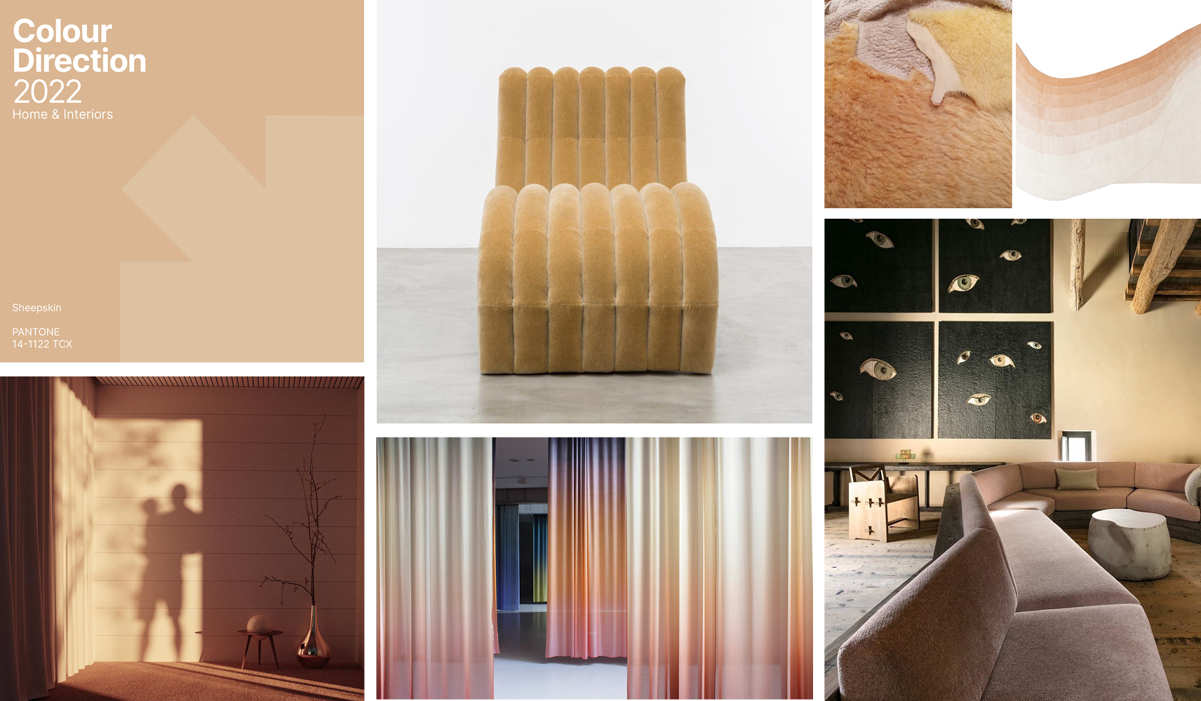 Left to right: Shine by Sho, Kaschuba Hommage, Monologue, Pierre Yovanovitch, Lucia Koch, Six N Five.
2022 sees consumers make a renewed investment in their home environments as they seek to decelerate their current pace of living. In light of this, the home becomes a sacred sanctuary, a place of refuge. Precious warm sunny evenings are spent cocooned in nourishing interiors, detoxing from noise and distraction. Soothing neutrals like Sheepskin tap into the movement against the cult of busy.
Sunflower, PANTONE 16-1054 TCX
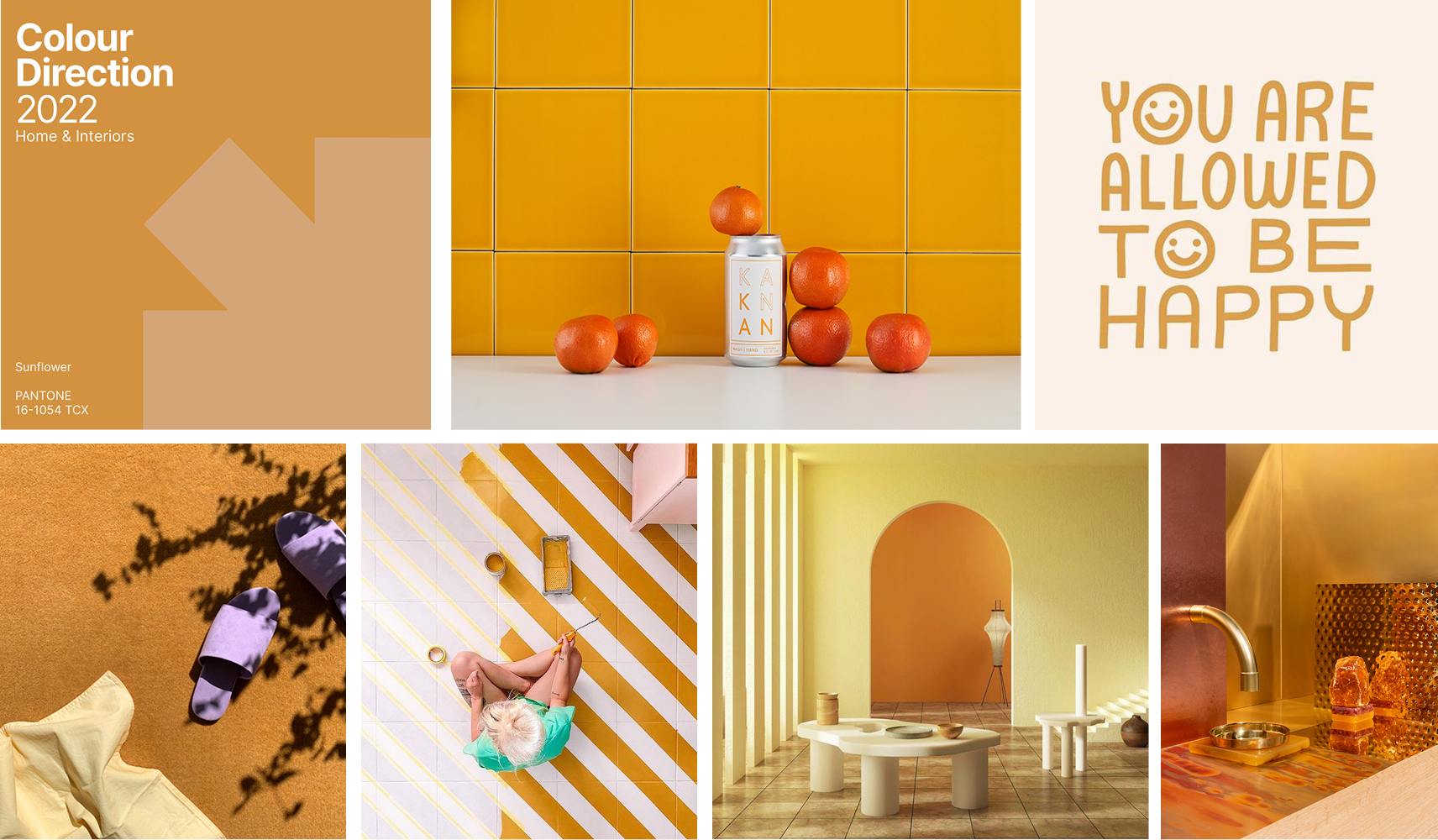 Left to right: Kankan London, TrendBible archive, Toniton, Terra+Tint, Dello Studio, Baars-Bloemhoff.
In the wake of a recession, social unrest and a global pandemic, consumers are driven by a need for optimism and joyfulness. Householders seek to surround themselves with constructive influences and joyful design. Within the home, art, colour, shape and materials all feed into this aesthetic of positivity. Joyful yellows like Sunflower provide the perfect antidote to the seriousness of modern life.
Forecasting through a global lens
These home trend colours have been selected for their versatility and suitability on a global scale. All key colours work well in both sunlit and shady conditions, appealing to homeowners in both the Northern and Southern hemispheres. Depending on the orientation of the natural light source, each of the hues will display a variegated tone throughout the day. Each hue can be used in varying quantities in interior design projects, whether that be wall to wall colour, or simply as an accent colour for soft furnishings, home décor, furniture, print and pattern.
The PANTONE® Reference names and/or numbers are from the PANTONE FASHION, HOME + INTERIORS color system (a component of the PANTONE Textile Color System®). The colors shown here are digital simulations, which may not match the PANTONE Color Standards. For accurate PANTONE Color Standards, refer to the current edition of the PANTONE® FASHION, HOME + INTERIORS cotton publications. PANTONE® and other Pantone trademarks are the property of Pantone LLC. Portions © Pantone LLC, 2020. Pantone’s trademarks and copyrights used with the permission of Pantone LLC under License Agreement with Trend Bible.