Colour Direction 2022: Seasonal Colour Palettes for Home & Interiors
 Kelly Wearstler
 Trend Bible’s Colour Direction 2022 outlines six PANTONE® TCX shades chosen by our colour experts, based on our seasonal trend forecasts for 2022.
These directional, yet commercially viable shades represent what we believe to be central to life at home. Here we explore how our three key shades can be adapted across four seasonal colour palettes for the Home & Interiors industries.
No colour works in total isolation. Our 2022 Colour Direction for the Baby & Kids and Home & Interiors industries outlines six shades which have been carefully selected to work with coordinating colours, which we have mapped out across seasonal colour palettes to show how they can be used. In this post, we share our four key seasonal colour palettes for Spring/Summer 2022 and Autumn Winter 2022/23 for the Home and Interiors industries.
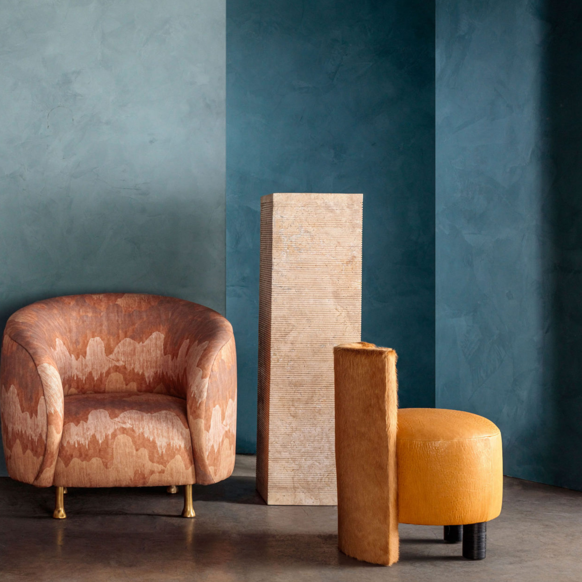
Spring – Sheepskin / High-rise / Storm Blue
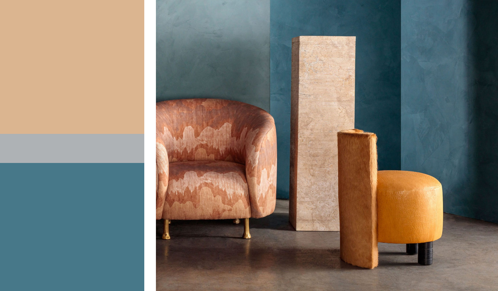
For spring, a ‘muting’ of overstimulation during lockdown saw householders begin to question the unwanted complexities of modern life. A level of softness emerges as deep teal shades of Storm Blue and greyed pastels of High-rise provide a moody backdrop to warm gold metallics and Sheepskin.
Summer – Sunflower / Dusty Pink / Pastel Lilac
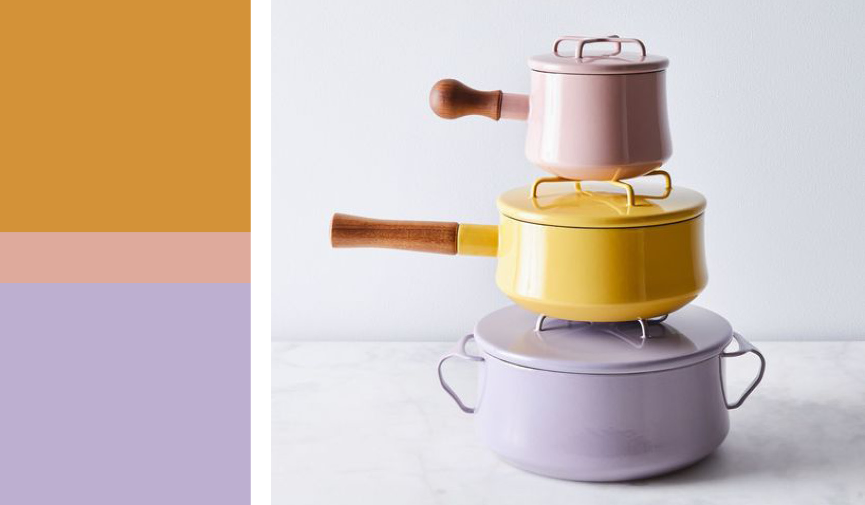
In the wake of recession, social unrest and a global pandemic, householders feel the desire to surround themselves with constructive influences and joyful design. This summer palette brings a sunny optimism to the most practical of products. Clean pastel shades of Dusty Pink sit alongside Pastel Lilac whilst highlights of Sunflower yellow nod to the 70s.
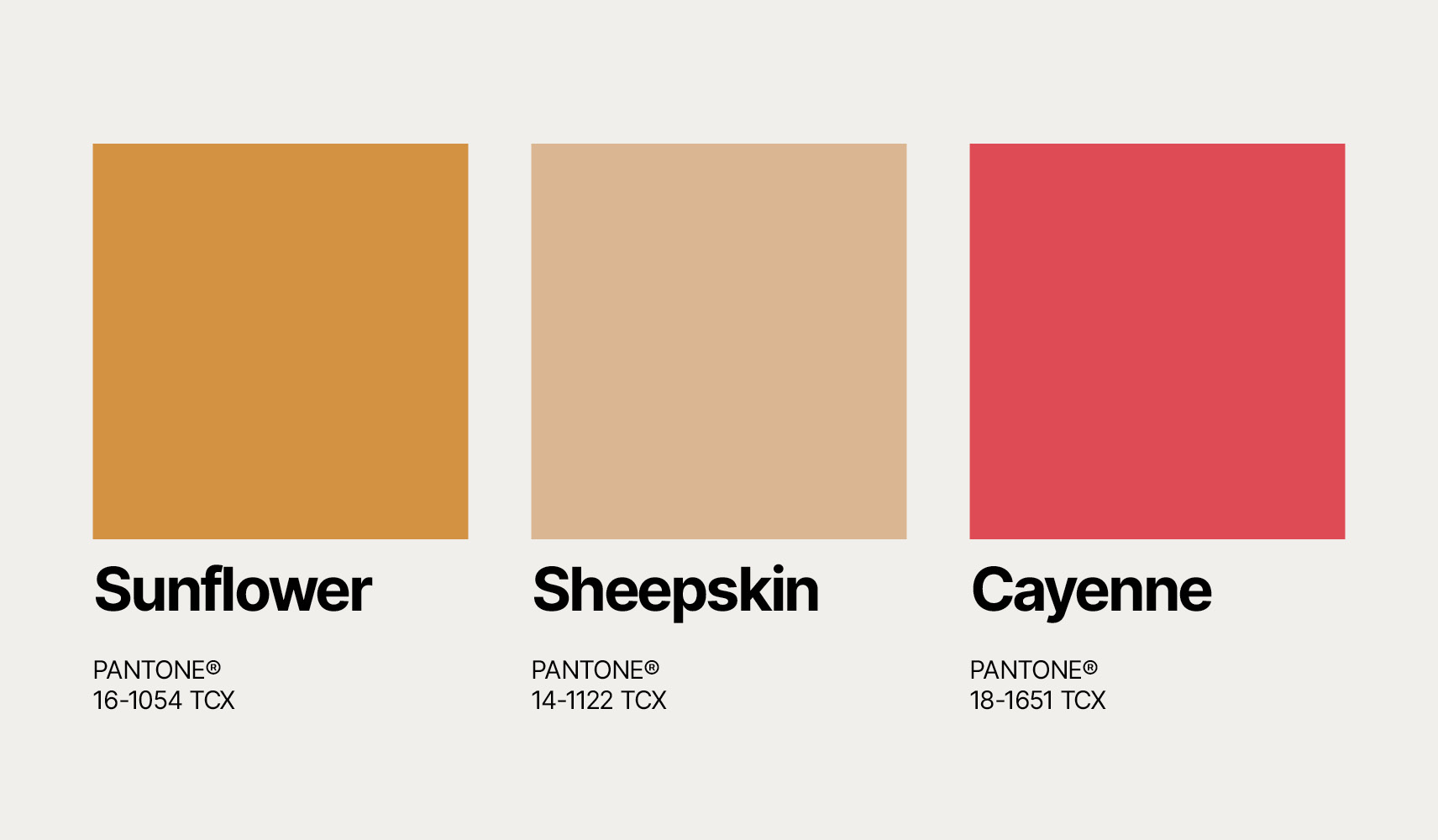
Autumn – Sunflower / Cashew / Bayberry
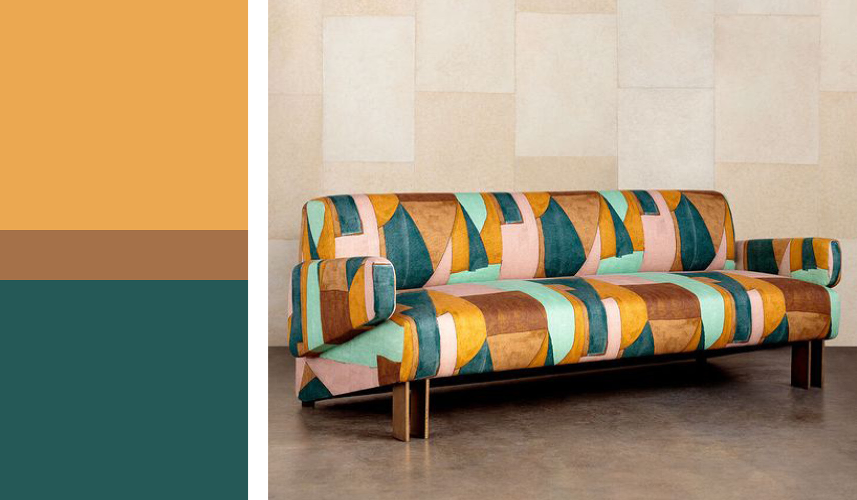
Creativity and joy are communicated through imaginative applications of colour in the home. This palette presents an opportunity to reinvent seasonal collections with playful contrasting combinations of Bayberry green and Sunflower yellow. Meanwhile, a pop of Cashew brown ensures this bright palette feels appropriate for autumn.
Winter – Fragrant Lilac / Beaujolais / Cayenne / Spectrum Blue
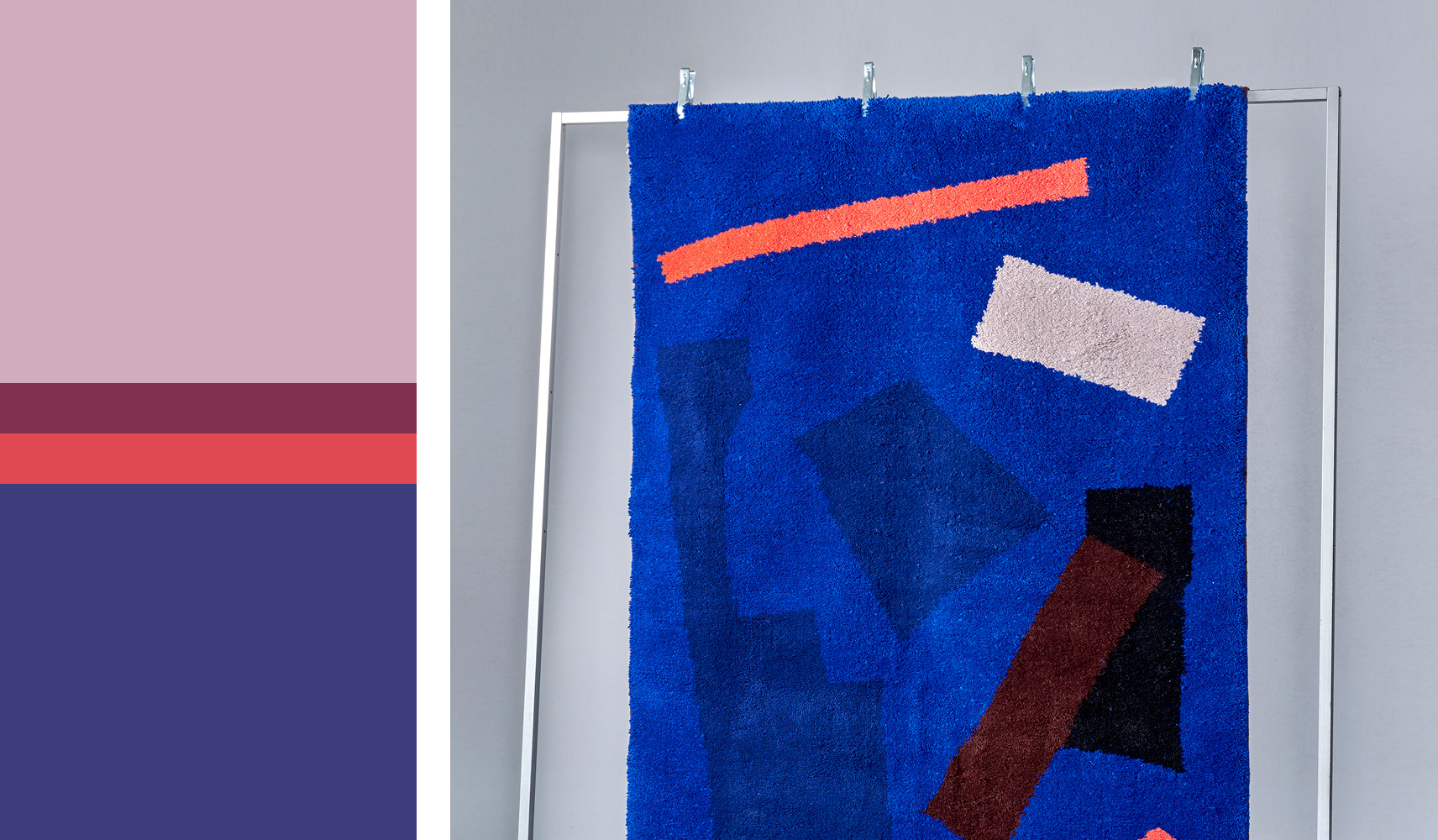
This winter combination is perfect for layering rich colour. Deep and clashing combinations of Cayenne and Beaujolais create a sensuous palette alongside a base of digitally inspired Spectrum Blue. Meanwhile, Fragrant Lily brings a softness of touch and an airiness to the palette.