Colour Direction 2022: Seasonal Palettes for Baby & Kids

Trend Bible’s Colour Direction 2022 outlines six PANTONE® TCX shades chosen by our colour experts, based on our seasonal trend forecasts for 2022.
These directional, yet commercially viable shades represent what we believe to be central to life at home. Here we explore how our three key shades can be adapted across four seasonal palettes for the Baby & Kids industry.
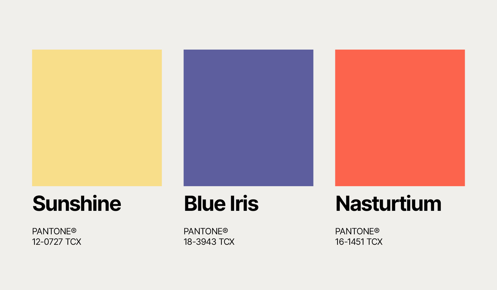
No colour works in total isolation. Our 2022 Colour Direction for the Baby & Kids and Home & Interiors industries outline six shades which have been carefully selected to work with coordinating colours which we have mapped out across four seasonal colour palettes. In this post, we share our four key colour palettes for Spring Summer 2022 and Autumn Winter 2022/23 for the Baby and Kids industry.
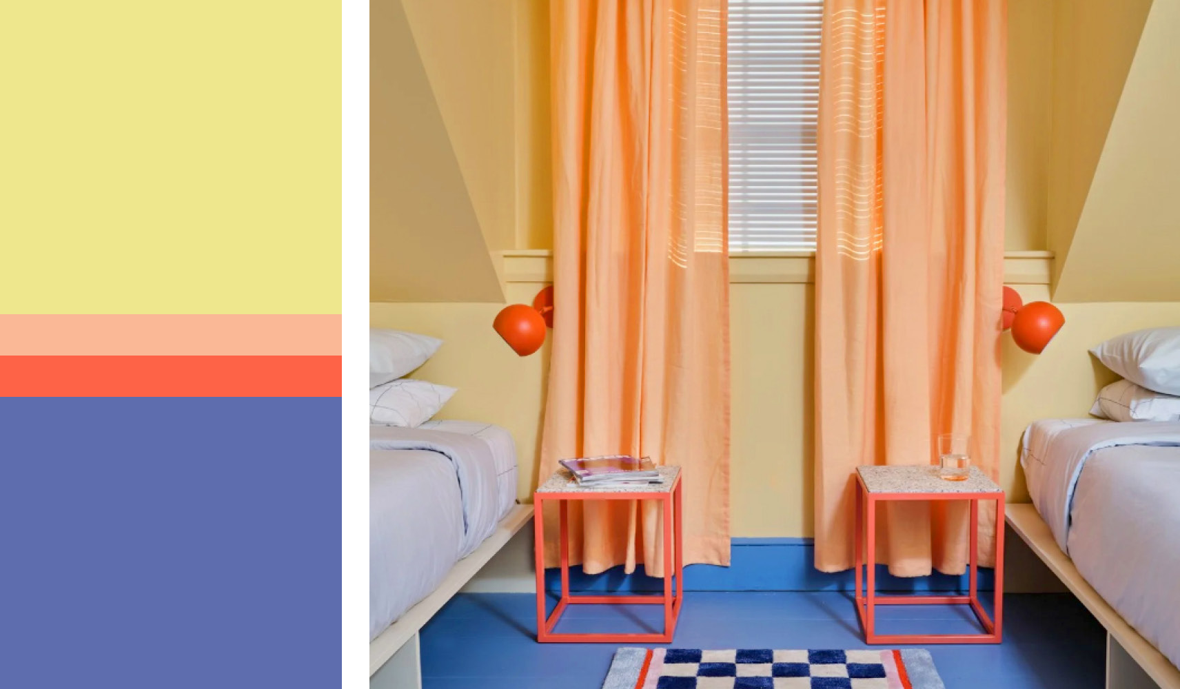
Spring – Rose Shadow / Baja Blue / Marine Green / Nasturtium
Empowered and ready to take action, in 2022 families come together to spread messages of hope, acceptance and optimism; leading the Love Revolution. Optimistic Nasturtium and Rose Shadow dominate this expressive, high energy palette whilst Baja Blue and Marine Green balance out the stronger tones.
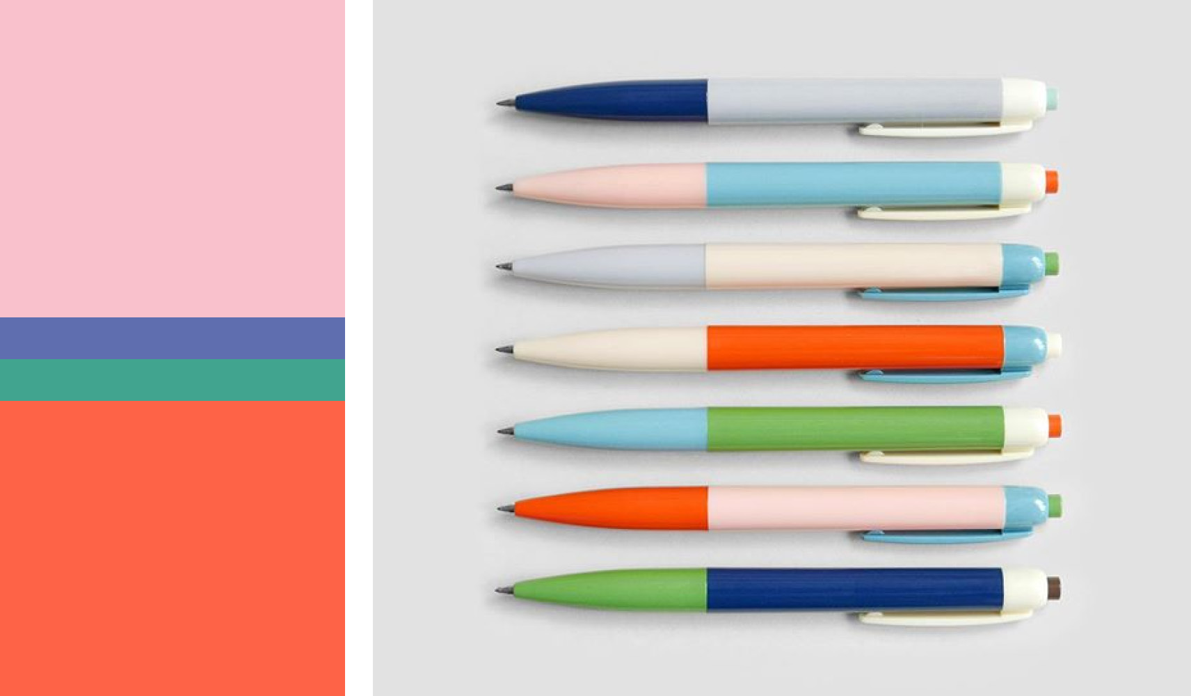
Summer – Yellow Iris / Beach Sand / Nasturtium / Baja Blue
Uninhibited and upbeat, this story sees children find the joy in the everyday. Colour direction for this summer palette contrasts pastels with saturated brights to lift the mood. Muted shades of Beach Sand and Yellow Iris are zapped by vibrant pops of Nasturtium in this happy, retro, colour clash palette.
Autumn – Sunshine / Barn Red
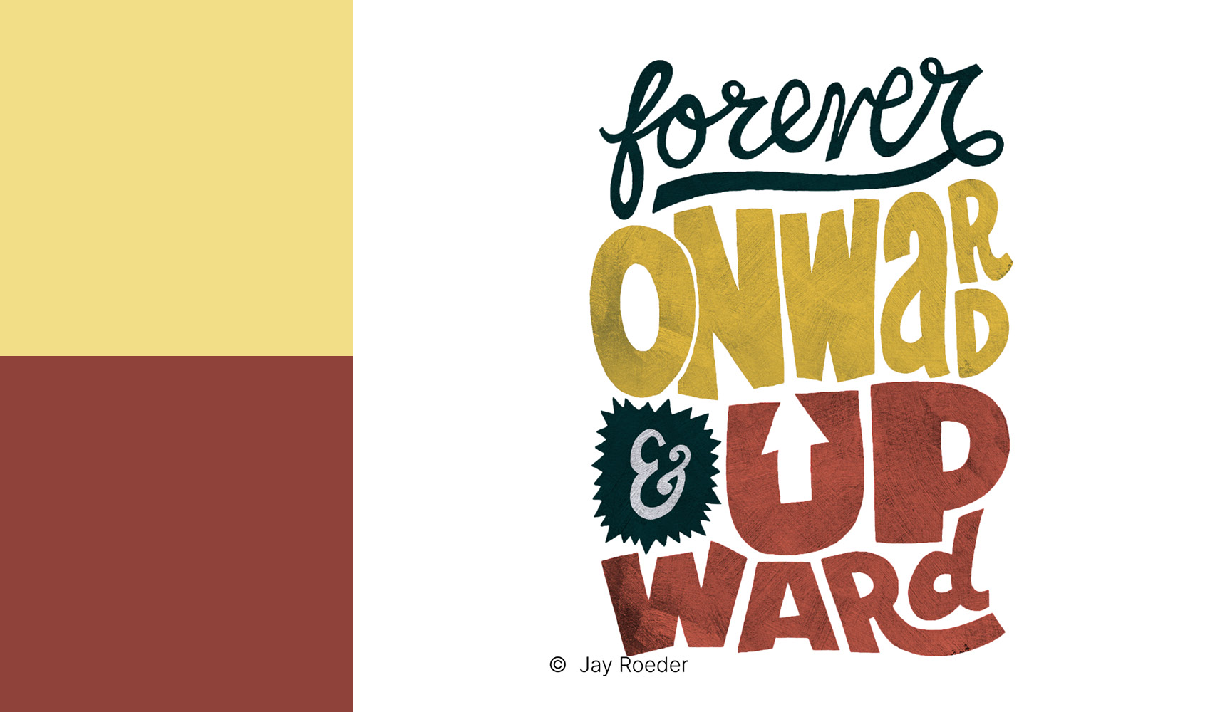
Consumers find the joy of movement, dance and rollerskating as an outlet for creative expression and freedom. In response, autumn palettes are driven by vibrant energy and retro skate culture aesthetics. Sunshine is grounded by Barn Red to create a soft yet friendly autumnal palette.
Winter – Dark Purple / Lollipop / Peat Moss / Blue Iris
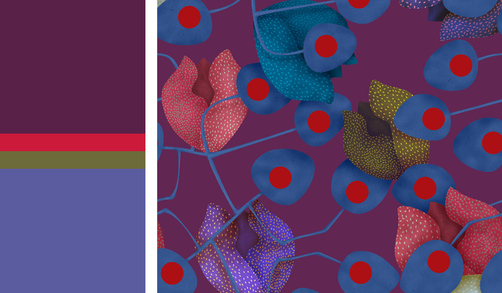
This story takes us deep into a magical forest, where children can wander down winding paths to mossy treehouses and fairytale cottages. This colour combination brings to mind winter moon skies in the deep dark wood. Peat Moss and Blue Iris place this palette firmly in nature, whilst sharp Lollipop and Dark Purple bring a more folky and sinister edge to the palette.